
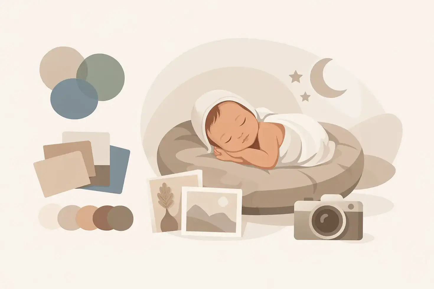
How to Choose Newborn Photo Colors That Feel Timeless
The tiny details you notice right now - the softness of your baby’s cheeks, their wispy hair, the way they curl into themselves - will change faster than you expect. Knowing how to choose newborn photo colors can help you preserve this brief season in a way that feels beautiful now and still feels like you years from now. The good news is that you do not need to arrive with a perfect palette planned. A thoughtfully styled newborn session should make this decision feel gentle, not like one more item on a very long new-parent list.
How to Choose Newborn Photo Colors With Ease
Start with the feeling you want your portraits to hold. Newborn images are often displayed for decades, so color is less about following a passing trend and more about choosing a mood that feels true to your family. Do you picture soft and airy artwork above your bed? Something warm and cozy for a nursery? A clean, classic portrait that will suit any future home?
For most families, muted colors photograph most beautifully. Think creamy ivory, warm beige, soft oatmeal, dusty rose, pale sage, delicate blue, or gentle lavender. These shades keep the focus where it belongs: on your baby’s little features. They also create the dreamy, peaceful look that parents often imagine when they book newborn portraits.
Bright colors can absolutely have a place, especially if they are meaningful to your family or fit a colorful nursery. The trade-off is that bold red, neon pink, vivid turquoise, and heavily saturated patterns may draw attention away from your baby’s face. If you love a stronger color, using it as a small accent rather than the entire setup often gives you the best of both worlds.
Let your baby’s coloring guide the palette
Every baby is different, and a beautiful color on one newborn may not create the same softness on another. Babies with warm or rosy skin often look lovely surrounded by ivory, oatmeal, muted peach, dusty pink, and warm taupe. For babies with cooler or deeper undertones, soft blue-gray, sage, cream, plum, or deeper neutral shades can be especially flattering.
This is not a strict rule. Newborn skin changes from day to day, and professional editing brings a polished, natural finish to your final portraits. Still, choosing colors that complement rather than compete with your baby’s complexion helps create a more harmonious image from the start.
If your baby has a full head of dark hair, light neutral wraps can create a beautiful contrast and make those sweet details stand out. For fair-haired babies, deeper muted neutrals can add gentle definition. The goal is never to match every feature perfectly. It is simply to create a setting that lets your baby be the heart of the photograph.
Begin With Your Home, Not Just the Nursery
Many parents first think about the nursery when selecting newborn photo colors, and that is a wonderful place to begin. If the portraits will hang there, look at the room’s walls, crib bedding, wood tones, and decor. A soft sage setup can feel especially lovely in a nature-inspired nursery, while blush and cream may suit a feminine, romantic space.
But consider where else you may display these photographs. Newborn portraits often find their way into a living room, bedroom, hallway gallery, or family album. Choosing a palette that works with your overall home can make your artwork feel intentional rather than temporary.
Neutrals are popular for a reason: they travel well. Cream, beige, warm gray, and soft white pair beautifully with nearly any decorating style and allow the portraits to remain timeless even if you repaint, move, or redesign a room. If you are unsure, a neutral base with one subtle accent color is a lovely, low-pressure choice.
Choose colors that tell your family’s story
The most meaningful palette is not always the one you saw in a recent photo trend. Perhaps you have always loved soft blue, your grandmother knitted a delicate blush blanket, or a muted green reminds you of the garden where you became engaged. These small personal connections can make your images feel even more special.
A sibling’s favorite color can also be a sweet starting point when older children will be included. Rather than placing everyone in matching outfits, consider using related tones. For example, a baby wrapped in cream and sage can be beautifully paired with a sibling in soft beige, light denim, or a muted floral dress. The colors will feel connected without looking overly coordinated.
Try to avoid building the entire session around a single theme or novelty item. A favorite stuffed animal or family heirloom can be included in a simple, meaningful way, but keeping the overall styling refined helps the images stay focused on the connection between your family members.
Decide Between Light, Earthy, and Moody Neutrals
If color choices still feel overwhelming, narrowing your direction to one of three families can make it easier.
Light neutrals include ivory, white, cream, pale blush, and whisper-soft pastels. They create an airy, delicate look and are especially beautiful for parents drawn to bright, ethereal portraits. Because these colors are so subtle, texture becomes important. A soft knit, delicate lace, or a gently layered blanket can add depth without adding visual clutter.
Earthy neutrals include oatmeal, caramel, terracotta, olive, warm brown, and muted rust. These tones feel cozy, organic, and grounded. They are a lovely choice for families who prefer warmth over a very light, all-white look. Earthy colors can also be especially forgiving if your home has natural wood, tan furnishings, or warmer wall colors.
Moody neutrals include soft charcoal, deep olive, muted navy, plum, and rich brown. These create a more dramatic, fine-art feeling while still keeping the overall look elegant. They tend to work best when used carefully, with enough soft texture and gentle lighting to keep the photograph feeling tender rather than heavy.
There is no better option among these three. The right choice is the one that feels most like the memories you want to hold onto.
Keep the Palette Simple
Newborn portraits have a quiet kind of magic. Too many colors, props, prints, and accessories can interrupt that calm. A simple palette generally photographs best: one main color, one supporting neutral, and a few textures that add softness.
For example, a pale blue wrap paired with cream layers and a small neutral bonnet feels complete without looking busy. A dusty rose setup with warm ivory accents can feel romantic and timeless. A deep sage wrap with oatmeal texture has a cozy, organic look that still keeps the eye on your baby.
Patterns deserve the same restraint. A tiny floral print, subtle stripe, or understated knit can be beautiful, but large logos, bold graphics, and competing prints tend to date quickly. If parents or siblings are photographed too, solid colors and small-scale patterns are usually the most flattering choice.
Trust the styling process
During the newborn weeks, you are already making countless decisions while recovering, feeding, soothing, and learning your baby. Photo colors should not become another source of pressure. At Cuddles and Kisses Photography, I guide each family through the styling direction so the final images feel polished, personal, and effortless.
A professional newborn photographer considers more than a color swatch. The wraps, layers, props, lighting, your baby’s complexion, and the overall flow of the gallery all work together. A color that looks lovely in a phone screenshot may need a warmer or softer companion in the studio. This is why sharing a few inspiration images and telling your photographer what you are drawn to is more helpful than trying to select every detail yourself.
If you are torn between two palettes, choose the one you would be happiest to see on your wall every day. That answer is usually more reliable than whatever is most popular at the moment.
A Gentle Way to Make Your Final Choice
Before your session, save a small collection of images that make you pause. Do you repeatedly choose creamy and light portraits? Are you drawn to cozy brown tones or soft pinks? Notice the common thread rather than focusing on individual props. Then think about your home, your nursery, and any family colors that feel meaningful.
From there, give yourself permission to keep it simple. Your baby will never again be this little, and the most lasting photographs are often the ones where their tiny face, curled fingers, and peaceful presence have room to shine. Choose colors that feel warm to you, then let the rest of the session be held with care.


Comments